Snæfellsjökull is a mouthful, as is most of the Icelandic language, but this letter scramble is actually the name of the Icelandic volcano in which Otto Lidenbrock, the main character in the Jules Verne novel Journey to the Center of the Earth (1864), begins his epic adventure to inner Earth. Our journey started in a bit more hospitable Reykjavík. After a short stay exploring the colorful and vibrant capital city and meeting up with friends for some traditional Icelandic snacks, we headed north into the land of elves and trolls and sweeping vistas of volcanic grandeur formed over millions of years and still forming to this day. Over the next 120 hours we drove over 600 miles venturing around observing many of the natural wonders of Iceland, including the Northern Lights, a myriad of glacier waterfalls, a full end-to-end rainbow (seen at 2:50 in the video above), natural hot-springs, black sand beaches and more. I can go on and on about the beauty of the land and the warmth of the people, but all I really want to say is this: GO SEE IT FOR YOURSELF. It is well worth the journey.

Photos taken on Samsung Galaxy S5 and used No Crop and Instagram to edit images. No filters were used and only a handful used LUX to add a bit of contrast – it truly is difficult to take a bad picture in Iceland! Video footage was made on a GoPro HD and edited in iMovie. The song used in the video was Dissolve Me by alt J


Every year in April the design world makes its pilgrimage to the country which gave birth to the concept of an international forum between industry, applied arts, and architecture with the International Turin Exposition in 1902. This global exposition was highly influential and breathed new life into furniture and interior design. Fast-forward 59 years when a small coalition of furniture manufacturers launched the Salone del Mobile with the aim of promoting the exportation of Italian furniture. This quickly proved itself to be an excellent marketing vehicle for a highly fragmented industry that would otherwise have lacked the means to express its overall potential. Since 1961, this trade show has evolved into what it is today – a massive, joyous celebration of international design, innovation, and creativity that dwarfs any other in comparison, and it only continues to grow (t
his year’s Salone del Mobile notched up a total of 357,212 visitors, which is up 13% from the 2013 edition… an auspicious sign for the design industry!). 

From the exhibit halls on the fair grounds in Rho, to the hundreds of events scattered all around the cosmopolitan city of Milano, the Salone is truly a visceral experience that cannot adequately be described in words alone. This short video is only a glimpse of what Haute Living observed and experienced during the record-breaking 2014 Salone del Mobile, and we’re literally counting down the days to Salone 2015. Enjoy! 

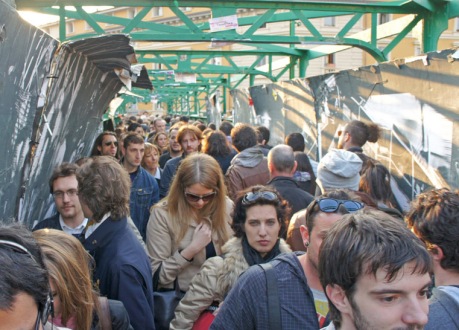
Tortona BridgeMatter Observed will be in Milano once again for the 53rd Annual Salone del Mobile, the quintessential furniture fair where the world converges to exhibit, discover, discuss, and celebrate the extraordinary world of design. This time I will be there (April 7th-13th) as a representative of Haute Living to seek out and report on the latest contemporary furniture and market innovations, highlight new products within the Haute Living collection of brands, as well as help curate future lines for Haute Living. Keep up with all the coverage by following Haute Living’s Facebook page, Twitter, Instagram, or bookmark Haute Living’s Design News blog for daily updates from the Salone.

Arrivederci!

Morocco_Matter Observed 1
Traffic began building on these roads about two years ago. Civil unrest triggered a social movement that called for reformations in the constitution. Some people call the movement The Arab Spring. Here, it’s more often referred to as The Democratic Spring. I was given the opportunity to travel the roads of Morocco as a part of a legislative fellows program wherein nonprofit professionals from Chicago meet professionals from NGOs in its sister city, Casablanca.

Like any big city, Casablanca is on the move. When I first arrived I felt like I had to hit the ground running, and faster than usual to keep up with its pace. The geographic bridge between Europe and Subsaharan Africa, globalism and multiculturalism define Moroccan society. Walking the streets, I overhear conversations between residents that flow from French to Arabic and sometimes English with ease. I see women in traditional hajibs and kaftans check their cell phones for messages, and a stylish young man light a cigarette as he leans against a centuries-old wall. It’s easy to see how the country earned its nickname, the global crossroads.

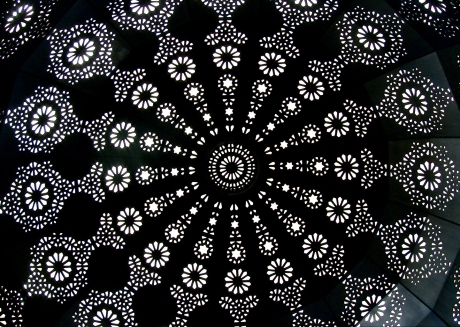
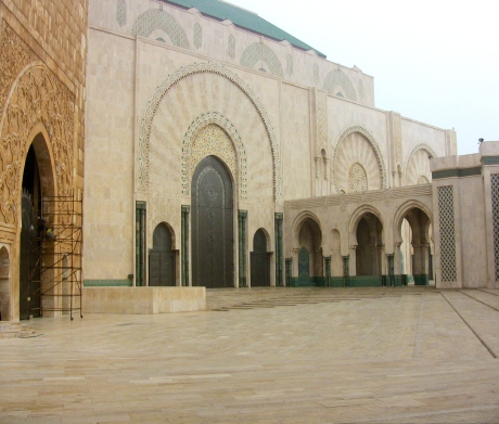
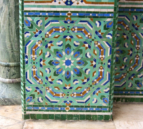
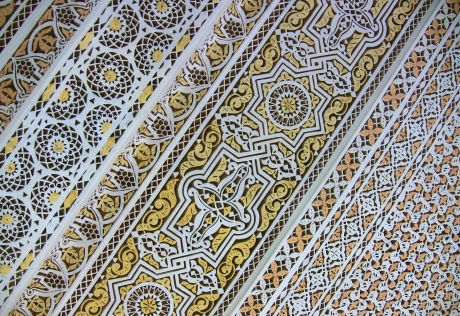
Morocco is also a country of aesthetic inspiration. Maybe it was the African sun, but colors seemed a lot bolder to me. I know the pinks are that pink because it helps deflect the heat out of the building. The blues are common, though I’m sure the color didn’t have the same functionality. Whether it was a farm, personal home, or holy institution, a lot of detail was put into the SPACE itself. And it did not go unnoticed. I was really drawn to windows, doors and tile work. As I walked through alleys, museums, ancient ruins, and mosques, I reveled in the detail so much that I had to capture it. Here are some of the images I observed during my time in vibrant, enchanting Morocco:

Morocco_Matter Observed 2 Morocco_Matter Observed 3 Morocco_Matter Observed 4 Morocco_Matter Observed 5 Morocco_Matter Observed 6 Morocco_Matter Observed 7 Morocco_Matter Observed 8 Morocco_Matter Observed 9 Morocco_Matter Observed 10 Morocco_Matter Observed 11 Morocco_Matter Observed 12 Morocco_Matter Observed 13 Morocco_Matter Observed 14 Morocco_Matter Observed 15 Morocco_Matter Observed 16 Morocco_Matter Observed 17 Morocco_Matter Observed 18 Morocco_Matter Observed 19 Morocco_Matter Observed 20 Morocco_Matter Observed 21 Morocco_Matter Observed 22
In addition to being a member of the staff at Community Media Workshop, Marissa Wasseluk is an active blogger, digital communicator, workshop presenter, food eater and music listener. Connect with her online here or here, at her e-newsletter training this spring, or at Making Media Connections this summer.

mariss in morocco

Marissa Morocco
Matter Observed is brimming with excitement to have guest blogger and foreign correspondent, Marissa Wasseluk, share her almost two week-long adventure to Morocco to learn more about the constitution reform post-Arab Spring. She got pooped on, interviewed an anarchist, met the mayor of Casablanca, and drank copious amounts of tea – and that was just the first 48 hours. Look for this story, told in both words and photography, on Matter Observed in the coming weeks!

9

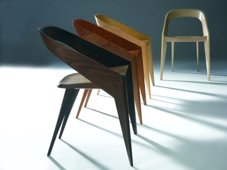
Just when you think the sun has set on the limits of the wooden chair form, a Los Angeles-based furniture designer stops time and gives us something spectacular. My Q&A with John Ford is the first in a new series of design-related interviews entitled, Five + 3, which will be published on Haute Living‘s blog, “Design News.” The Five + 3 format will ask five questions pertaining to the work, process, philosophies, etc. of the interviewee, and three off-topic questions. The interview will also feature dynamic black and white images of the subject’s work. The idea of Five + 3 is to shed light and give a new perspective on the chosen subject, as well as some insight into the personality of the interviewee – all in a condensed, easily digestible format.

Please enjoy the inaugural Five + 3 interview with furniture designer, John Ford.

eams house, ray eames, case study house 8, mid-century modern

Huzzah! The first Matter Observed post of the new year is to announce that I won Inhabitat’s Top Original Reporting for this story I wrote (and photographed) on the Eames Case Study House last month. And in case you missed it, I also wrote a Matter Observed post and made a short video about the modern design mecca earlier this year.  A nice start to to 2013!

Here’s to more designing, more writing, more photographing, more blogging, and more discovering this New Year. I cannot wait to share all of this with you, right here on Matter Observed.

Best wishes to you in 2013!

Ever since we featured Washington D.C. born artist Alexa Meade in a Matter Observed post last year, we’ve been wistfully anticipating her next project. Well, the waiting is over. Alexa’s new work is a collaboration with LA-based actor and performance artist, Sheila Vand. Meade uses her signature brush-strokes-on-body technique, only this time using milk as her backdrop to “explore the fluidity of form in relation to time and space.” According to her artist statement, she explains that “by stripping the subject of depth and dimension, a displacement of identity ensues, demonstrating the power of context over content.​​” Here’s a behind the scenes glimpse at Meade’s enticing new project:

http://vimeo.com/51727498


Sheila Vand explains, “our process is a constant dialogue between destruction and creation so the symbolism of milk, a reproductive substance, is an integral component.” Alexa Meade adds, “if the lines that we use to define the contours of our identities are constantly shifting shape, then we want to redraw those lines in a way that exposes the masks we wear for what they are – an illusion.”

For more info and striking images, go to “Milk: what will you make of me?

Chicago Home+Garden‘s third annual “Chairs for Charity” was held at Consentino‘s beautiful West Loop showroom on Wednesday night. The evening was a resounding success with proceeds benefiting Design Industries Foundation Fighting AIDS (DIFFA). Matter & Order has been a huge fan of this event ever since being a part of the inaugural Chairs for Charity back in 2010. Some of Chicago’s leading designers and artists took inspiration from all sorts of places and transformed existing chairs, usually in disrepair, into showstopping, interior design centerpieces. Check out this year’s designs below:

“Palermo” by Aimee Wertepny of PROjECT. interiors

Designer’s Statement: “PROjECT. was inspired to create a chair that’s a glam mash-up of chic and cozy, edgy and sezy. A statement piece that’s as engaging to the eye as it is to the touch (and tush).”

“Declan Chair” by Francine Turk; Jillian O’Neill Interior Design

Designer’s Statement: “Jillian O’Neill has a passion for designing furniture and Francine Turk was inspired to paint roses after stumbling upon an amazing rose garden while on a trip with O’Neill in Charlotte, NC.”

“Rejent” by Jennifer Sweas Design

Designer’s Statement: “Vintage 1970s chair revamped into classic contemporary. I wanted to take the great bones of this chair, polish up the frame, and revamp the upholstery with textures that make it warm, touchable, yet clean in appearance to complement and interior. It is quiet and elegant with classic contemporary styling. I selected a gorgeous ash-colored leather, with mohair in a silvery gray on the seat and a frost tone on the back to contrast with the bright polished chrome frame.”

“Gathered Together” by Souice Horner Ltd.

Designer’s Statement: “Gathered Together was inspired by the resurgence of the industrial found objects movement that’s recently gained a lot of momentum. The initial exhilaration of finding a one-of-a-kind item on a treasure hunt is short-lived when we later discover that the piece has simply gathered dust in a drawer or otherwise dimly lit chamber. When gathered together, these items create a magnificent way to revisit the past – while managing the point towards the future.”

“Mahogany Belt Chair” by Blake Sloane of Rebuilding Exchange

Designer’s Statement: “This chair was particularly beat up when I found it. It had been reupholstered countless times in the past century, then left under a porch for the last 20 years. After removing the nearly 100 rusty tacks, it took a little care to re-glue the mortise and tenon joinery, and a lot of elbow grease to clean up the mahogany frame. The only part I rebuilt was the chair seat, from reclaimed mahogany flooring. I often use belts to reupholster furniture, and feel the bring so much color and texture to the piece. I especially love that you can still see all of the ear and tack holes from previous upholstery. Perhaps in a few decades someone else will come along and ind another creative way to modify this chair.”

“Mandarin” by Pradeep Shimpi of Shiani

Designer’s Statement: “The classic library chair and especially the armchair are well designed and comfortable. I wanted to create a more angular, modern juxtaposition to the curves of the original and add of bit of whimsy with the brushed aluminum and oriental feel.”

“08.24.12” by Paul Schulman Design

Designer’s Statement: “In thinking about what a chair is, its meaning and usage, I thought about chairs that have reference to place and events. This chair was originally in a monastery library. Made of thick walnut with very utilitarian design, it just feels solid; it spoke to me about integrity. When I made this chair, I was thinking about a day of grave violence in our city, and the plastic rods represent shots – with every gun shot, integrity is sacrificed.”

“Max” by Debra Phillips of Scentimental Gardens

Designer’s Statement: “This once-proud chair lost its pizzazz; worn, torn, and dirty, but what wonderful bones it possessed. Max was in need of a contemporary update with fabrics, paint, and a plethora of nail heads. He shines once again.”

“The Cork Cathedra” by Trevor O’Neil Design

Designer’s Statement: “Furniture is sculpture to me. And as much as I love to engineer a good chair, sometimes I’d rather just carve one out. Using only reclaimed or leftover materials made this project that much more rewarding. Only the LEDs in this chair were purchased new.”

“Rally Bench” by Carson Maddox Studios

Designer’s Statement: “Rather than create something out of a whole cloth, the goal is to transform the mundane, to take a pedestrian object that we regularly encounter but rarely notice. To see something with fresh eyes and imagine the possibilities. That, and a racing stripe.”

“New Mexico Bergere” by Lance Lawson of space519

Designer’s Statement: “The light color of this chair reminded me of the hone-colored wooden vigas and furniture of Santa Fe. Its simple, strong lines provided the perfect backdrop for the bold, bright woven colors and pattern of the blanket. I loved marrying the distinctly European form of the chair with the ethnic feel of the upholstery.”

“Intern Gilly” by Erik W. Kolacz & Keitha A. Brathwaite of Contrast Design Group, Inc.

Designer’s Statement: “The muse for Intern Gilly was our summer intern – a modern classic with an unconventional streak. A juxtoposition of clean lines and funky upholstery (with exposed seams) hints at the fact that you never know what to expect from this gal. Oh, Gilly, behave!”

“Noir Bloom” by Joel Klaff & John Diekmann of Workroom Couture Home

Designer’s Statement: “A modern approach to a traditional wingback chair, creating a dialogue of contrast: black/white, masculine/feminine, and plaid/floral.”

“The Violette Chairs” by Wendy Kaplan of The Chair Affair

Designer’s Statement: “These chairs had been left for dead at my upholsterer’s – stripped of fabric, but with these great bones. I envisioned them as sexy French parlor chairs. The smoky purple velvet has a seductive feel, and the hand-blocked and embroidered fabric from Seema Krish adds a hint of the exotic.”

“A Club Chair Named Desire” by Michele E. Fitzpatrick of Verde Design Studio, Inc.

Designer’s Statement: “I had always wanted to incorporate Tony’s (Fitzpatrick) work into a piece of furniture. The reproduction of the drawing collage ‘Desire’ as a cushion seemed to be a warm and sensuous use of this lovely work of art.”

A special “thank you” to my friend Vanessa for these lovely photos of the event!

The heated debate over Bertrand Goldberg’s Prentice Woman’s Hospital building came to a head yesterday as the Commission on Chicago Landmarks finally heard the argument from staffers of the Department of Housing and Economic Development (HED) as well as public support to save the brutalist structure from demolition. After nearly six hours of hearing and granting preliminary landmark status, the Commission, chaired by Rafael Leon, overturned landmark status by a landslide vote of 8-1 at the meeting’s finale rendering Prentice a sitting duck.

As a recent adherent of this preservation saga, admittedly not knowing the all the intricacies and politics that undoubtedly lie beneath the surface, I see both sides as having valid positions:

Northwestern University

Northwestern University, the rightful owner of the property as of early Summer 2011, wants to build a brand new, massive (1.2 million square feet) biomedical research facility on the current site with aspirations to become a global leader in research on cancer, cardiovascular disease, diabetes, and neurodegenerative disorders. University spokesman Alan Cubbage said that Prentice is a 1970’s hospital designed for a totally different purpose, and can’t facilitate 21st medical research. He (Northwestern) believes that preservation of buildings with historical and cultural significance is a good goal, but doing research into diseases that kill people, and bringing thousands of jobs and hundreds of millions of dollars in federal research funds to Chicago are also very good goals. According to its website, the University will “attract an additional $150 million a year in new medical research dollars, create 2,000 new full-­time jobs, and generate an additional $390 million a year in economic activity in Chicago.” Northwestern University plans to demolish the old Prentice building and hold a design competition for its new research facility within the next calendar year.

The Save Prentice Coalition

Conversely, the preservationists are urging the commission for preliminary landmark status in order to protect the relatively young, 37 year old quatrefoil-shaped building designed by notable Chicago architect, the late Bertrand Goldberg. Though the University believes that Marina City is a better example of Goldberg’s work, the preservationists argue that Prentice is vitally important on numerous fronts. First, the architect is one of Chicago’s own, and he’s just now beginning to get the credit that he’s due. Second, the building is important to Chicago’s architectural heritage and the history of Streeterville. They also argue that if you look at Prentice in terms of its architectural design (cloverleaf-shaped concrete tower), its engineering (cantilevered decks from a single column), how it was designed to change the way that woman’s healthcare was provided (“care clusters”), and the fact that it was one of the first buildings to have used computer aided design software in its design, that it is extremely significant to the legacy of modern architecture. According to the Preliminary Summary of Information in the official Agenda of the Commission of Chicago Landmarks:

“Goldberg was an early adopter of computer technology within the architectural profession, and during the design of Prentice he modified software then in use by the aeronautical industry to design the building’s unprecedented cantilevered structure. Prentice is one of the first tall structures designed using computer analysis, and the computational method used to create it is now an essential tool in architectural and structural design.”

Original floor plan of Prentice Woman’s Hospital

Supporters and Detractors

A cadre of noted architects and engineers are in favor of preserving Prentice, including eight Pritzker Prize winners and the entire office of Skidmore Owings & Merrill (SOM). The Chicago architecture firm Studio Gang submitted an unsolicited rendering of an adaptive reuse solution, building a 31 story bowed square-shaped tower on top of the original building (see below). The Save Prentice Coalition immediately praised it, and the University just as quickly rejected it saying it doesn’t meet basic criteria for their vision of a modern, state-of-the-art research facility.

Christina Morris of the National Trust for Historic Preservation said that this “doesn’t have to be an either/or choice, and that there’s room for both reuse and research;” Architecture critic and WBEZ contributor Lee Bey said that “the preliminary landmark designation would temporarily spare Prentice from demolition for a year, and it would give City Hall the ability to examine whether a permanent designation and reuse plan are possible by working with the university, preservationists and experts” (a sensible idea, though time is of course money); Mayor Rahm Emanuel has recently sided with the politically powerful institution saying, “It is clear that the current building cannot accommodate the groundbreaking research facility that Northwestern needs to build, and I support the decision to rebuild on the site,” essentially sealing the fate of old Prentice; while the Chicago Architectural Club, in conjunction with the Chicago chapter of the American Institute of Architects has called for new ideas from architects, artists, and designers in an open competition called “Future Prentice” – which could amount to a “what if” exhibition if landmark status is not granted.

So What’s Your Point?

This brings me to why I’m sounding off on this issue that again is relatively new to me: of all the figurative pushing and shoving I’ve read on both sides of the issue, and of the few adaptive reuse concepts that I’ve seen in the press thus far (I’m interested in seeing more), to my knowledge there has not been one mention of structure relocation as a viable solution and a way to appease both the University and the preservationists. In spite of its structural shortcomings and, to some, aesthetic shortcomings, wouldn’t recycling Prentice by moving it to a new site and giving it a new purpose be a logical solution to the problem? Northwestern can build their billion-dollar research facility, and the preservationists can have their Goldberg. Though not historic preservation in the purest sense, it is, after all, a better outcome than a plaque and box of photographs.

Now I certainly don’t know or claim to know the financial investment or logistical scope involved of what would surely be a challenging feet of structural engineering in order to save Prentice from the kiss of the wrecking ball – but, in a “make no little plans” city, a city that reversed the flow of the Chicago River and twice built the world’s tallest building (the Willis Tower in 1974 and the Burj Khalifa in 2010), if Prentice is truly an architectural masterpiece and a national treasure as so many have claimed, isn’t the topic of structure relocation and a recycled Prentice as a compromised solution in lieu of demolition worthy of at least a conversation, if not further exploration? And, by gifting the building to the city in order to save it (and responsibly move it off the land), wouldn’t Northwestern save in millions of dollars of demolition costs? Now that Rahm has spoken and a decision has been made, I’m curious to know if recycling Prentice is something both parties would even consider at this point. It may still be too early as I’m certain we haven not heard the last word from the preservationists.

My Connection to Goldberg and this Story

Why has this story grabbed my attention so much as to spend time thinking and blogging about it? Well, I’ve been familiar with Bertrand Goldberg for years. My father was a construction worker for James McHugh Construction Co. and helped build Marina City back in 1964; I recently worked on an interior design project in Goldberg’s boutique hotel turned condominium building, Astor Tower in the Gold Coast; and, living across the street from a mothballed brownfield, site of the old Grand Central Station (Harrison and Wells), I can’t help but see another complicated Goldberg structure just to the south, Marina City (1972-1989). As many problems the building has endured over the years (namely flooding), every day packed tour boats navigate down the South Branch of the Chicago River to River City showing hundreds if not thousands of architecture buffs and tourists alike the strangely unique concrete S-shaped complex. Irony or not, directly across the river is the land where 141 years ago, Catherine O’Leary’s infamous cow knocked over the lantern (or so the legend goes) that ultimately razed and paved the way for the city to become a hotbed for architects from all over the world to rebuild the city, thus beginning Chicago’s world renown architectural heritage. Despite these three connections to Bertrand Goldberg’s buildings, until the recent media attention over the preservation of Prentice, I had never really given too much thought into his work or his legacy on the city in which I call home.

Marina City

Astor Tower

Architectural boat tours

Preservation via Structure Relocation

As I mentioned above, I live across the street from a brownfield site that has been sitting vacant since 1971, around mid-construction of Prentice Woman’s Hospital. The seven acre plot that runs adjacent to the Chicago River has been an unauthorized park for the last 20 years, where people use the land for various activities, including golf, football, baseball, soccer, Frisbee, cross-training, pep-rallies, and theater, to name a few – there’s even a cricket league that plays their matches there. It’s also the city’s largest unofficial dog park.

In 1931, William Randolph Hurst moved the Santa Maria de Ovila Monastery 6,500 miles from Spain to San Francisco. What if…

we were to take the old Prentice building and relocate it 2 miles southwest to the site of 700 S. Wells (with or without the Miesian black box it currently sits on), turn the grounds surrounding it, including the riverfront, into a public park (think the Peggy Notebaert Nature Museum), encase it in a glass box envelope (to prevent the “frosting drip” on concrete buildings when it rains) creating a light-filled atrium. One possible occupant could be the Chicago Center for Green Technology, giving it a secondary location, one that is closer to the people of Chicago (and to the thousands of tourists that pass the site every day on the architectural boat tours… i.e. a new revenue stream on the river, if you will) as its current location is 4.5 miles west of the Loop. Farr Associates, who have completed some amazing preservation and LEED projects, including the Chicago Center for Green Technology, and Perkins+Will would tag team the preservation, architecture, and landscape design.

“Frosting drip” on Prentice

Glass box examples

Chicago ranks among the top cities in the United States in green building design. What better way to symbolize both our architectural heritage and our leadership and commitment to green building practices and cradle-to-cradle design than to breath new life into old Prentice?

In yesterday’s hearing, Phil Enquist of SOM urged the Commission to “embrace the tradition of big, bold ideas, and identify a plan for reuse.” My (quickly conceived and crudely rendered) concept is just one example of many “big, bold” ideas for reuse I am certain are out there, if only the architects and planners were given the opportunity and a little more time.

Re-imagine, recycle, and reinvent.

Long live Prentice.